 Doilies Make the Difference – Video
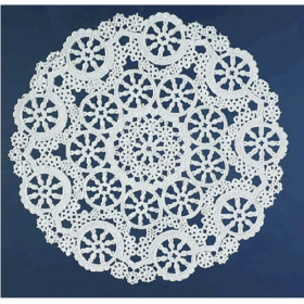 Lace Paper Doilies
Geographics Stationery
A Practical Guide to Choosing Decorative Paper for Any Occasion
How to Choose the Right Decorative Paper for Any Occasion: A Complete Guide
Choosing decorative paper may seem simple at first. You see a design you like, imagine how it might look with your message, and place it in the printer. In practice, though, a good result depends on more than the border or background alone.
The right paper should fit the occasion, leave enough room for your content, print clearly, and support the overall tone of the message. A formal certificate needs something different from a classroom announcement. A holiday letter can be warm and playful, while business correspondence usually benefits from a cleaner, more restrained look.
That is what makes decorative paper so useful. It gives you a visual starting point without forcing you to design every page from scratch.
Whether you are preparing invitations, awards, school materials, family letters, announcements, event programs, or professional correspondence, a few simple choices can make the finished page look much more polished.

Start With the Occasion
The first thing to consider is not the design itself, but the reason you are printing the page.
Different occasions call for different visual styles.
For a graduation certificate, you may want a classic border with enough space for the recipient’s name and award details. For a birthday invitation, brighter colors and a more playful design may be appropriate. A business letter usually works best with subtle decorative elements that do not distract from the message.
Thinking about the occasion first helps narrow down the options.
It also prevents one of the most common mistakes people make when choosing decorative stationery: selecting a page that looks attractive on its own but does not really match the content that will be printed on it.
The paper should support the message, not compete with it.
Think About Who Will Receive It
The audience matters just as much as the occasion.
A design that works well for children may not suit a corporate event. A very formal page may feel too stiff for a family celebration. A colorful seasonal design might be perfect for a classroom notice but less suitable for a professional announcement.
Before choosing a style, think about the person who will receive the page.
What kind of impression should the design create?
Should it feel professional, cheerful, elegant, festive, traditional, creative, or personal?
Once you know the answer, it becomes much easier to choose decorative paper that feels appropriate instead of random.
Leave Enough Space for the Message
One of the most important things to look at is how much usable space the design leaves in the center of the page.
Some decorative sheets have thin borders and large open areas. Others include large illustrations, wide borders, or detailed artwork.
Both can work well, but they serve different purposes.
If you are printing a full letter, announcement, newsletter, or detailed set of instructions, you will probably need a design with plenty of open space.
For a short invitation, certificate, menu, or sign, you may be able to use a more detailed layout.
A useful rule is to imagine your finished text on the page before you print anything.
If the design already takes up a lot of space, your content may feel crowded very quickly.
Decorative Paper for Business Use
Decorative paper can work well for business communication when the design is chosen carefully.
It may be useful for thank-you letters, customer notices, event announcements, internal recognition, presentations, special correspondence, or printed inserts.
For professional use, simple usually works better than elaborate.
A clean border, subtle pattern, or restrained design can make a document feel more polished without making it look overly decorative.
The message should remain easy to read, and important information such as names, contact details, dates, and calls to action should stand out clearly.
If you are also adding a company logo, make sure it does not visually compete with the existing artwork on the page.
Giving each element enough space creates a more professional result.
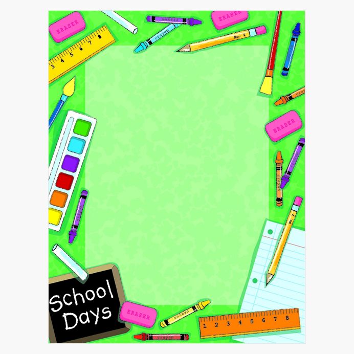
Decorative Paper for Schools and Classrooms
Teachers can use decorative paper in many different ways throughout the school year.
It can help make classroom communication more inviting and give printed materials a more finished appearance.
Common uses include parent letters, student awards, announcements, activity sheets, reading projects, bulletin board materials, welcome notes, classroom rules, and event notices.
The design can also help reinforce the purpose of the page.
A school-themed border can make an announcement feel more relevant. Seasonal artwork can connect classroom activities to a holiday or time of year. A more formal design can make certificates and student recognition feel special.
Decorative stationery can also help teachers visually organize materials by using different styles for different purposes.
For example, one design might be used for parent communication, while another is reserved for student awards.
Choosing Paper for Certificates and Awards
Certificates are one of the easiest places to see how much the right paper can change the final result.
The words may be the same, but presentation matters.
A well-chosen border can make an award feel more official and more meaningful to the recipient.
When choosing paper for certificates, make sure there is enough room for the most important information: the recipient’s name, award title, date, organization, and signatures.
Traditional borders often work well for academic or professional certificates. More colorful designs may be better for younger students, clubs, sports, or informal recognition.
Also consider how the certificate may be displayed.
If it is likely to be framed, leaving enough open space around the edges can make the final presentation look cleaner.

Invitations and Special Events
Decorative paper is a practical option for creating invitations without starting from a completely blank page.
A good design already establishes part of the mood, which means you can focus on the event details.
It can be used for birthdays, graduations, weddings, showers, retirement parties, community gatherings, dinners, school events, fundraisers, or small business events.
The main thing to watch is readability.
If the page contains a colorful or detailed design, place the text in the clearest area possible.
Avoid printing important information directly over busy artwork.
You also do not need several decorative fonts just because the paper is decorative.
One attractive heading font paired with a simple, readable font for the details usually looks more balanced.
Holiday and Seasonal Printing
Seasonal paper can make printed communication feel more personal without requiring a complicated design process.
Christmas letters, holiday greetings, school notices, church announcements, party invitations, family newsletters, and seasonal business messages can all benefit from a themed background or border.
The best design depends on the tone you want to create.
A family holiday letter can be warm and playful. A business greeting may look better with a more subtle seasonal design.
Holiday stationery can also be used for much more than letters.
You can create menus, event signs, gift certificates, recipe sheets, party games, classroom activities, thank-you notes, or promotional inserts.
Using coordinated designs across several printed materials can also make an event feel more organized and intentional.
Make Sure the Paper Works With Your Printer
Before printing, always check that the paper is suitable for your printer.
Different printers use different technologies, and specialty paper can react differently depending on how it is printed.
Inkjet printers apply liquid ink to the page, while laser printers use toner and heat.
For most standard decorative papers, printing is straightforward, but it is still worth checking the product details and printer recommendations before starting a large project.
This becomes especially important if the paper includes coatings, metallic details, adhesive elements, or other finishes.
A quick test print can help you catch problems before you use an entire pack.
Check the Margins Before Printing
Printer margins are easy to forget until something gets cut off.
Most home printers have limits on how close they can print to the edge of the page.
If the decorative design already occupies part of the border area, your text needs to stay comfortably inside the printable zone.
Before printing multiple copies, test one page and check the alignment.
Look at the top, bottom, left, and right margins.
Make sure your text feels centered and does not sit too close to the border.
A small adjustment can make the page look much more balanced.
Use Templates When They Make Sense
Templates can make the printing process much easier, especially when you need consistent placement across several pages.
They are useful for invitations, certificates, awards, announcements, and other materials where names, headings, or text blocks need to line up correctly.
Instead of repositioning everything from scratch, a template gives you a structure to work with.
Depending on the paper you are using, you may be able to create your layout in Word or use an online tool such as iClicknPrint to personalize the page before printing.
The goal is not to make the process more complicated.
A good template simply helps you keep the design balanced and reduces the amount of trial and error.
Do Not Overdesign the Page
One of the easiest ways to make decorative paper look less professional is to add too much.
If the page already has a border, background, or illustration, you usually do not need several extra graphics, multiple colors, and several different fonts on top of it.
Let the paper do part of the design work.
Use simple typography, clear spacing, and enough white space around the text.
This keeps the page readable and makes the decorative elements feel intentional rather than crowded.
A cleaner layout often looks more polished than a page filled with competing details.
Choose Colors That Keep the Text Easy to Read
Color can make a page more attractive, but readability should always come first.
Dark text on a light background is usually the safest choice.
If the paper includes strong colors, patterns, or illustrations, avoid placing important text directly over those areas.
For invitations and certificates especially, names, dates, addresses, and other key information should be easy to find at a glance.
If you use colored text, make sure there is enough contrast with the background.
A design may look beautiful on screen and still be difficult to read once printed.
That is another reason a test print is so useful.
Think Beyond Traditional Letters
Decorative paper is much more versatile than the name might suggest.
It can be used for all kinds of printed materials, including:
- event programs
- menus
- classroom worksheets
- award certificates
- welcome signs
- thank-you notes
- church bulletins
- club announcements
- printed schedules
- party games
- recipe sheets
- promotional inserts
- meeting agendas
- small business notices
This flexibility makes decorative stationery useful to keep on hand at home, in classrooms, and in offices.
A versatile design can often be reused for several different purposes.
Store Paper Carefully
Good printing starts before the page reaches the printer.
Paper that is bent, damp, curled, or dusty can cause feeding problems and affect the final appearance.
Store unused sheets flat and keep them in a dry place whenever possible.
Leaving the paper in its original packaging can help protect the edges and prevent dust from settling on the surface.
If the paper has been stored in a cold or humid environment, allow it to adjust to room conditions before printing.
It is a small step, but it can make the printing process smoother.
Always Print One Test Page First
This may be the most useful habit of all.
Before printing invitations for an entire event or certificates for a full class, print one sample.
Check the spelling.
Check the alignment.
Confirm the margins.
Make sure the font size feels right.
Look at how the text sits inside the decorative design.
One test page can save a surprising amount of time, paper, and ink.
It is especially helpful for symmetrical layouts, because even small alignment issues become noticeable when the design has a defined border.
Choosing Decorative Paper With Confidence
The best decorative paper is not necessarily the most colorful or detailed option.
It is the one that fits the occasion, works with the amount of text you need, prints clearly, and supports the mood of the message.
Start by thinking about the purpose of the page and the person who will receive it.
Then consider practical details such as usable space, printer compatibility, margins, color contrast, and layout.
Subtle designs can add a polished touch to professional correspondence, while colorful patterns and themed borders make school materials more engaging. A well-chosen border can give certificates a more meaningful presentation. Invitations and seasonal projects also benefit from decorative paper that sets the right mood before recipients even read the message.
And because the design is already built into the page, you do not need advanced design skills to create something that feels thoughtful and well presented.
The right paper gives you a strong starting point.
What you print on it is what makes it yours.
