 Doilies Make the Difference – Video
 Lace Paper Doilies
DIY Arts & Crafts Projects
How to Make Your School Presentation Stand Out
How to Make a School Project Stand Out: Poster Board Design Tips
A School Project Stand Out moment often begins when the research is finished, the photos are printed, and the notes are ready. Suddenly, the table is covered with pieces that somehow need to become one clear presentation.
That is usually when the questions start.
Is the title big enough? Should the photos go in the center? Is there too much text? Why does everything look more crowded on the board than it did on the computer? And how do you make a project look interesting without covering it in every color, sticker, and decoration you can find?
The truth is, a school presentation does not have to be complicated to stand out.
The projects that catch your attention are often the simplest ones to understand. You notice the topic immediately. The information follows a natural order. The colors help you find what matters. The photos have a reason to be there. And nothing feels as if it was squeezed into the last available inch of space.
Whether you are working on a history assignment, book report, science fair project, research presentation, or another classroom display, good presentation design starts with one idea:
Make it easy for someone to understand your project.
Everything else follows from there.
Before You Decorate Anything, Decide What the Board Needs to Do
It is easy to start a project by thinking about how it should look. Maybe you already have a color in mind. Perhaps you’ve found a lettering style you like. You might also want to include photographs, charts, or brightly colored paper. Those choices can come later. First, think about what you actually need to show.
A presentation about a historical event might need a timeline, several photographs, a short explanation of what happened, and a section about why the event mattered. A literature project could have a central theme, a few important characters, quotes, images, and a short analysis.
A science project may need much more structure: a question, hypothesis, procedure, photos of the experiment, data, results, and a conclusion.
Those are very different projects, so they should not automatically use the same layout or even the same type of board.
For a straightforward classroom project, a traditional poster board may give you all the space you need. A 22″ x 28″ poster board works well for many presentations because it is large enough to create a strong visual display without becoming difficult to carry or manage.
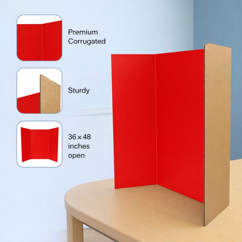
If your project has several distinct sections, a tri fold poster board may be a better fit. The side panels create natural divisions, while the center gives you a strong focal point.
The important thing is to choose the board based on the information you have not to choose a board first and then desperately try to make everything fit.
That small difference in approach can save you a lot of trouble later.
How Poster Board Size Can Help Your School Project Stand Out
One of the most common problems with school presentations is not really a design problem. It is a space problem. You can create a perfectly good layout on a computer screen, print everything, and then discover that your paragraphs, photos, graphs, and title take up far more room than expected.
That is why poster board size should be part of the planning process from the beginning.
A smaller presentation board can work beautifully when the project has one strong topic, limited text, and a few supporting visuals. If you have several sections or large charts, you may need more space. But going larger does not automatically make the project better.
An oversized board with only a few small pieces of information can look empty and disconnected. On the other hand, a board packed from edge to edge can make even excellent work difficult to read.
Think about the amount of information and how people will view it.
- Will the board hang on a classroom wall?
- Will it stand on a table during a science fair?
- Will your classmates see it while you speak from the front of the room?
- Will people walk up to it and read it on their own?
Those questions matter when choosing among different poster board sizes.
If the board will be viewed from several feet away, large headings and visuals become more important. If people will stand close to it, you have a little more freedom to include smaller details.
The right size gives your information room without creating space you feel forced to fill.
Build the Layout Before You Build the Project
Once you have the board, resist the temptation to start gluing. This is the part of the process where a little patience usually pays off. Lay the board flat on a table or floor. Place the title on it. Then add the photos, text sections, charts, maps, illustrations, or other materials you plan to use. Nothing should be permanent yet. Move things around.
See what happens if the largest image moves from the side to the center. Try shortening one section of text. Change the space between two photos. Move the conclusion higher.
Sometimes a layout that looked perfect in your head simply does not work once the pieces are physically on the board. That is normal.
You are not fixing a mistake. You are designing.
One useful way to think about the layout is to imagine someone seeing your project for the first time.
Where will that person’s eyes go first?
Usually, you want the title or central idea to answer that question.
What should they see next?
Perhaps a photograph, an important fact, or the first section of the project.
And after that?
The board should quietly guide them through the information.
If a viewer has to stop and figure out where the presentation begins, the layout is doing too much work against you.
This becomes particularly important with a tri fold poster board.
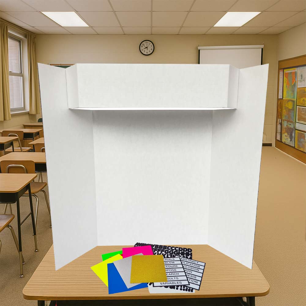
The center panel naturally attracts attention, so give it something worth looking at. Your title can sit there, but the center does not have to be only a title area. It can also contain your strongest image, your main research question, an important graph, or the central message of the project. Then let the side panels support it. A thoughtful layout can make your School Project Stand Out before your audience reads a single word.
Easy-to-Read Presentations Help Your School Project Stand Out
There is a major difference between writing a paper and creating a display. A paper is designed to be read from beginning to end. A presentation board is usually scanned first. People see the title. Their eyes move toward a photograph. They notice a heading. Maybe a number catches their attention. Only then do they decide what they want to read more closely.
That means a board full of long paragraphs can actually hide good information. You do not need to put everything you discovered during your research onto the board.
Choose what deserves to be seen.
- If you have a long explanation, ask whether it can become two shorter paragraphs.
- If you have several numbers, consider whether a simple chart would communicate them faster.
- If your project involves a sequence of events, a timeline may work better than a block of text.
- If you are comparing two things, placing them side by side may be clearer than explaining the comparison in several sentences.
- This does not mean turning your entire project into bullet points.
- It means matching the way you present information to the way people actually look at a display.
- Your spoken presentation can carry the details.
- Your board gives those details structure.
Color Should Help the Story, Not Become the Story
Walk down a school hallway during project season and you will probably see every possible approach to color. Some boards use almost none. Some look as if every marker in the box needed a turn. The most effective option is usually somewhere in between. Color works best when it has a purpose.
Start with your background. A white poster board gives you a clean, flexible base and strong contrast with darker text. Colored boards can work too, especially when they fit the subject, but readability should always come first.
Then choose one or two colors to repeat throughout the project.
Maybe blue appears in every section heading.
Maybe green is used for results or key findings.
A brighter accent such as neon orange can draw attention to one especially important fact or section.
That kind of contrast can make a project feel energetic without making it chaotic.
The mistake is using every strong color everywhere.
If five things are shouting for attention at the same time, the viewer does not know which one matters most.
The same rule applies to fonts.
You do not need a different font for every section. One clear font for body text and another for titles or headings is usually enough.
And before you print everything, test the size.
What looks large on a laptop screen can look surprisingly small once it is placed on a presentation board.
Print one sample paragraph, attach it temporarily, and step back a few feet.
Can you read it comfortably?
If not, make it larger or shorten the text.
Straight Lines Help Your School Project Stand Out More Than Fancy Decorations
One of the simplest ways to make a school project look polished is alignment.
Photos that line up.
Headings that begin at the same point.
Even spacing around text.
Margins that feel consistent.
None of those things is particularly exciting on its own, but together they make the entire presentation look organized.
If alignment is difficult, a grid poster board can make the process easier.
The printed grid provides a guide while you position photographs, text, graphs, diagrams, or other elements.
That is obviously useful for math, science, engineering, and technical presentations, but it is not limited to those subjects.
A grid board poster board can also help with a history timeline, a research display, or any project where you want clean rows and consistent spacing.
You do not need to measure every element down to the millimeter.
The goal is not mechanical perfection.
You simply want the viewer to feel that things were placed deliberately rather than wherever there happened to be room.
And sometimes that means leaving room empty.
Empty space is not a sign that you forgot something.
A little space around the title makes it stronger.
Space between sections makes them easier to distinguish.
A clean border around a photograph allows the image to stand on its own.
Not every inch of the board needs a job.
Use Pictures to Explain, Not Just Decorate
Photos are often the first thing people notice on a school display, which makes them valuable space.
Use them well.
A photograph should ideally do more than make the board look colorful.
In a history project, an image can show a person, location, object, or moment that helps the viewer understand the period.
A map can explain geography much faster than a paragraph.
A timeline can make decades of information easy to follow.
For a literature project, an image might help establish setting, explain symbolism, or visualize relationships between characters.
And for a science project board, visuals can be especially powerful.
Photos can show different stages of an experiment. Graphs can make changes in data immediately visible. Diagrams can explain something that would otherwise require several paragraphs.
Think about what would be difficult to explain with words alone.
That is usually where a visual can help most.
At the same time, avoid adding photos simply because an area looks empty.
If the picture does not help explain the project, it may be taking attention away from something that does.
Science Fair Boards Need a Clear Story
Science fair projects deserve special attention because they often have more information to organize than a typical classroom presentation.
A science fair display board may need to communicate the project question, hypothesis, research, materials, procedure, experiment, results, and conclusion sometimes all on one board.
The solution is not to make everything smaller.
It is to decide what matters most.
Someone approaching your display should quickly understand what you were trying to find out.
Then they should be able to see what you did.
Finally, they should be able to find what happened.
That basic story question, process, result is the backbone of a strong science fair project board.
The supporting information should help tell that story instead of competing with it.
A large results graph may deserve more space than a paragraph describing every material used.
A photograph of the experiment may explain the setup better than several sentences.
Your conclusion should be easy to find because that is where the project ultimately leads.
A tri-fold format works especially well here because the panels can help separate different stages without breaking the overall flow.
For projects that need additional rigidity, a foam trifold board can also be useful. A more structured surface may work better when the display contains several mounted pieces, larger photos, or other lightweight materials.
Again, there is no board that is automatically right for every assignment.
Choose the material according to what you are actually building. Choosing the right board and organizing each section clearly can help your School Project Stand Out while keeping the science story easy to follow.
Do a Five-Second Test Before You Call It Finished
After working on a project for several days, it becomes surprisingly hard to see it the way someone else will. You already know where every section is, what each photo means, and where the conclusion is hidden. Your audience does not have that advantage.
Before presentation day, set the board up and step a few feet away from it. Give yourself only a few seconds to take it in, just as someone might when walking past it in a classroom or science fair. The title should be easy to spot, the subject should be clear, and the layout should feel organized rather than crowded.
Then move closer and look at how the information flows. You should be able to see where the presentation begins, understand which section comes next, and find the most important points without searching for them. If one image dominates the entire board or a key section seems to disappear, that is usually a sign that the balance needs a small adjustment.
Finally, check the details from up close. Make sure photos are straight, captions sit with the right images, text is easy to read, and everything is securely attached. Often, the fix is not a complete redesign. Moving a photo, shortening one paragraph, increasing a heading, or adding a little more space between sections can make the whole presentation feel much more polished.
Let the Board Help You Present
A good presentation board should do more than sit behind you while you speak. It can become a useful part of the presentation itself, helping you explain ideas more clearly and giving your audience something visual to follow along with.
If you are discussing a graph, refer to it while explaining the results. When a historical location is important to your topic, use the map on the board to give your audience context. For a science project, photographs from different stages of an experiment can help show how the process developed instead of leaving you to describe every detail.
Using the board this way can also make presenting feel more natural. Rather than relying only on notes, you have visual reminders that help guide you from one part of the project to the next.
It is worth practicing at least once with the finished display beside you. You may notice that a chart that looked perfectly clear while you were building the project is harder to see from a few feet away, or that an image needs a caption to make sense. These are usually small changes, but catching them before presentation day can make the entire project easier for your audience to follow.
What Really Makes a School Project Stand Out?
A school project does not need more glitter, brighter colors, or the largest board in the classroom to get attention. In fact, adding too much can sometimes make the important parts of the presentation harder to notice.
What tends to make a project stand out is clarity. Someone should be able to look at the display and quickly understand what the project is about, where to begin, and which information matters most. A clear title attracts attention, a thoughtful layout creates a natural flow, and carefully chosen colors and images make the information easier to understand.
The board itself plays an important role too. A simple 22″ x 28″ poster board may be all you need for a classroom assignment with a few key sections and visuals. A tri fold poster board can provide more room for a project that includes research, images, results, or several stages of information. A grid board may be useful when precise alignment matters, while a sturdier board can make sense for a larger science fair display.
The right choice depends on the project rather than on a single formula. A great history presentation will not necessarily look like a great science project, and a book report does not need to follow the same layout as a research display.
What they can all have in common is a presentation that feels balanced, organized, and easy to follow.
When that happens, the board no longer competes for attention with the information on it. Instead, it quietly does what a good presentation board should do: help people notice, understand, and remember the work you put into the project. In the end, thoughtful choices in layout, color, spacing, and structure are what truly help your School Project Stand Out.
Use iClicknPrint® to quickly customize and print certificates without needing design experience.
You may also like


Royal Consumer Products®
Neon Assorted Poster Board 5 Colors, 22″x28″, 5/pack, 10 packs/case by Royal Brites®
Royal Consumer Products®
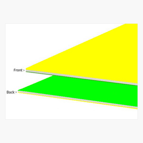
Neon Yellow/Green Foam Board Two Cool®Color 20″x30″ by Royal Brites®
Royal Consumer Products®
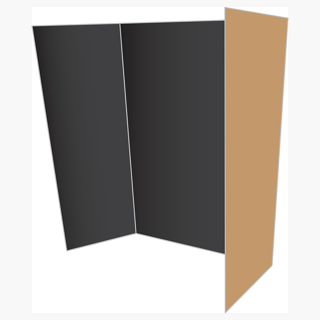
Black/Kraft Tri-Fold Project Board Two Cool Colors, 36″x48″, 12/case by Royal Brites®
Frequently Asked Questions
How can I make my School Project Stand Out?
Start with a clear layout, an easy-to-read title, and only the most important information. Use images, colors, and spacing to guide attention instead of filling every part of the board.
What is the best poster board size for a school project?
The best size depends on how much information you need to present. A 22" x 28" poster board works well for many classroom projects, while larger or tri-fold boards can provide more space for detailed presentations.
Is a tri fold poster board better for school presentations?
A tri fold poster board can be especially useful when your project has several sections. The center panel creates a natural focal point, while the side panels help organize supporting information.
How much text should I put on a presentation board?
Keep the text concise enough to scan easily. Use short paragraphs, clear headings, charts, timelines, or images when they can explain information faster than a large block of text.
What makes a science fair display board effective?
A strong science fair display board tells a clear story. The question, process, results, and conclusion should be easy to identify, while photographs, graphs, and diagrams should support the explanation rather than compete with it.
